

Some templates surface this description, for instance in the header area. Furthermore, it's used if this page is indexed by a search engine.
REMIX RE-BRAND
My Role: Concept, Design + Art Direction and Animation
REMIX is a global summit on Culture, Technology & Entrepreneurship, exploring the future of the creative and cultural industries.
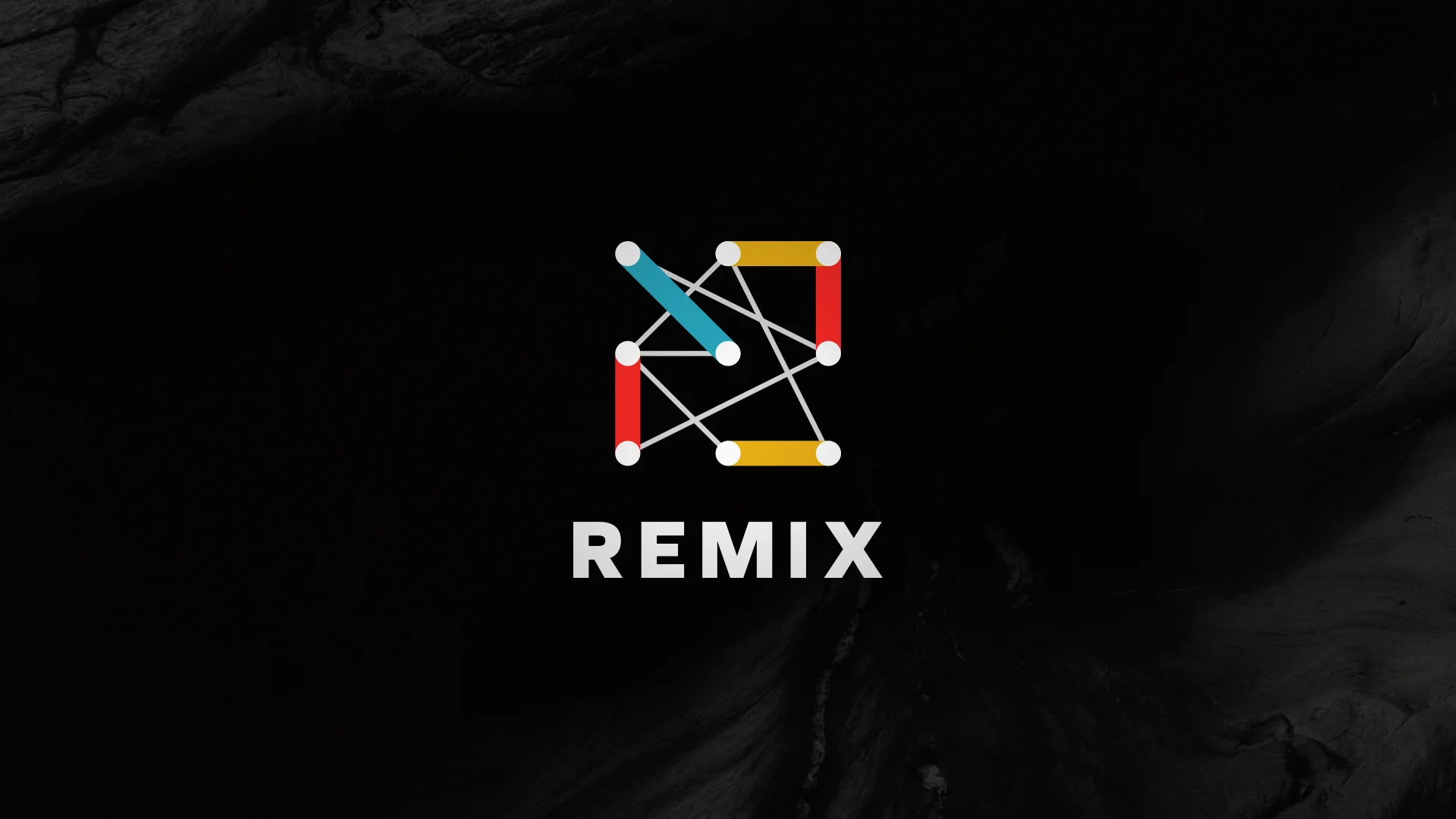
Overall the core them of this brand identity is a simple one: 'connection'. Bold lines of different colours represent the connection of their main elements: Culture, Technology & Entrepreneurship.
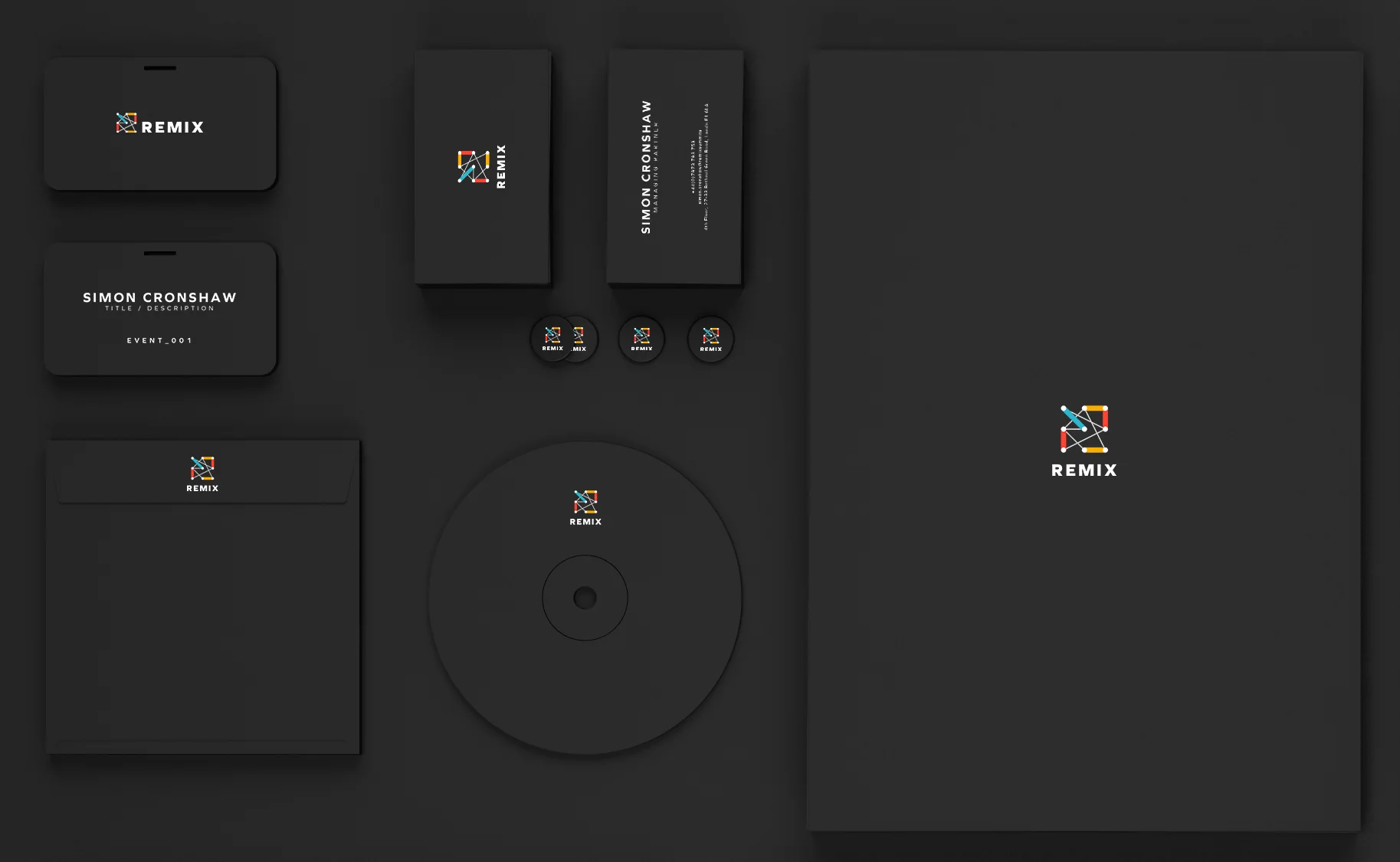
The final hero logo is in a square format, strong, balanced and bold. It's designed to put the brand front and centre. In the exploration, I designed strictly typographic logos and logos that included a mark or and icon. They were never over-worked or shouting too loud.


Below is the Remix Summit in Sydney with the new logo displayed at the event.
The 30 second idents were born as Remix requested something to introduce their new logo and brand identity at major events in Sydney and London. These idents are also used as part of Remix Academy’s marketing materials.
The main concept is simply the journey of the three elements to become the Remix logo. I broke down the three key elements of Remix Culture, Technology, Entrepreneurship) using abstract visual language for this ident.
REMIX Re-brand credits:
Client: REMIX SUMMITS
Sound Design: Jim Friend (Rooted Production)
Branding Mock-up Template: Shaan Shiv Suleman
Year: 2015